


For the nvisionaries Science Fair, front end lead Oliver Ramirez-Velazquez created a sample design system, demonstrating how creating this collection of standards, resources, and components prior to development could help shape a seamless user experience with ease.
“I’ve wanted to experiment with building a cohesive design language prior to development and use new tools to ensure design behaviors.” -Oliver Ramirez-Velazquez, Front End Lead (Milwaukee Region)
A design system is a collection of elements that standardizes a brand identity, offering a shared design language for any product or project to ensure a cohesive identity in anything you deliver to users. This includes the traditional elements of brand identity like a logo, colors, typography, and image treatment, but goes beyond design to include styles and guides for the full development process. Conventions for how code repositories are set up, naming conventions, architectures, and testing requirements are all placed within the design system as well.
A component library is a critical part of a design system. This library contains each of the individual elements, like buttons, inputs, and headers, that you’ll be using when you build your product – these elements can then be combined to create a pattern library with reusable widgets that will provide that cohesive user experience as you build.

In order to rapidly prototype for this project, Oliver used the Radix UI reusable component library and worked with fellow nvisionaries Shauna Fowler (UX Lead) and Kevin Jennings (UX Architect) for the style guide to base his components on.
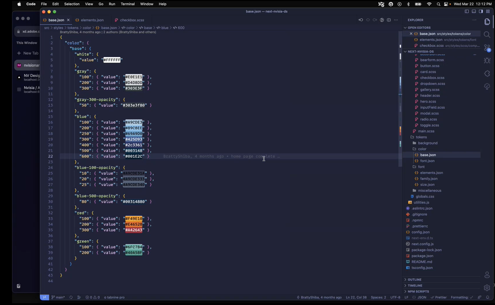
Oliver started his component library with the creation of design tokens. These are the most basic units of styling that can be applied to an element, like color, typography or font sizes. Almost anything that can be a single line of CSS styling code can be thought up as a design token. Since these tokens are reusable throughout your project, you’re able to standardize specific design elements and have a significantly reduced risk of inadvertently introducing design defects or elements that don’t comply with the design language.
To create these design tokens, Oliver utilized Style Dictionary, an open source library that allowed him to create a master JSON library to declare all his tokens – from there, the tokens can be configured as necessary for any output platform.
When accessing Style Dictionary, the design tokens can be split off into different sub-styling sections and self referenced across different files. When the CSS variables are generated, they can be created within default stylings and are constrained by the original style token, making them expandable and extensible for whatever use case they may be needed for. This also means that if a decision is made down the road to change a color, changing the design token will waterfall the change into the rest of the code base.
This also streamlines the process for implementation, since the design tokens can be reused throughout the project. Instead of having to go back to reference a style guide to determine the appropriate color and place it, you can reference whatever the token is and the work is already done.

He then used Storybook to develop components in an isolated environment. It’s important to create components outside of the noise that might occur within an application and make sure the components aren’t taking into consideration any specific content to make them fully reusable. Instead, you can determine a full set of different behavioral states or iterations of a component on its own and make sure that all the design elements are reflected accurately in each individual component.
Storybook also allows developers to test for responsiveness, accessibility, and more within the application. Since it is an open source product, you can also add additional testing functionality. For example, if you’re testing against accessibility guidelines, Storybook will make recommendations within the interface to make sure your component is compliant with best practices. One of the major benefits of working with Storybook is how it enhances the development workflow since your testing of the component is fully focused on the component itself rather than its implementation in a larger system.

Building isolated component libraries in this fashion allows you deliver features much more quickly since you’re building a component to be flexible rather than building directly to content. Troubleshooting will most likely be handled in the data layer or state level of the application instead of implementation within the UI. What you have created is now endlessly reusable and even if used in multiple irrelevant efforts, it will remain aligned with the overall brand.
As design systems consultant Nathan Curtis stated, “A style guide is an artifact of design process. A design system is a living, funded product with a roadmap & backlog, serving an ecosystem.” In creating a design system, you’re building a system rather than artifact – it demands collaboration between all parties and stakeholders, from designers to product owner, and will remain a living, functioning thing for the entire life of the product or brand.
Meet the nvisionary
|
Name: Oliver Ramirez-Velazquez |
|
Are you a creative technologist with a passion for experimenting with emerging technology? Learn more about joining our team and becoming an nvisionary!